
This is pretty mind blowing from the Copernicus Climate Change Programme
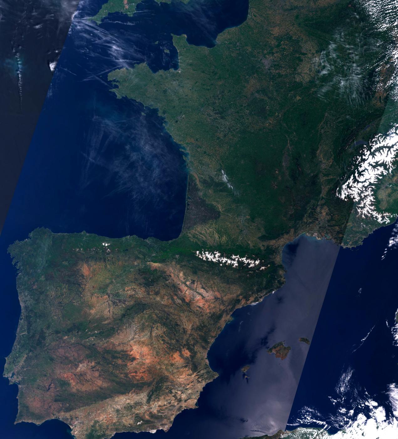
First up we’ve got France in mid May 2019 …
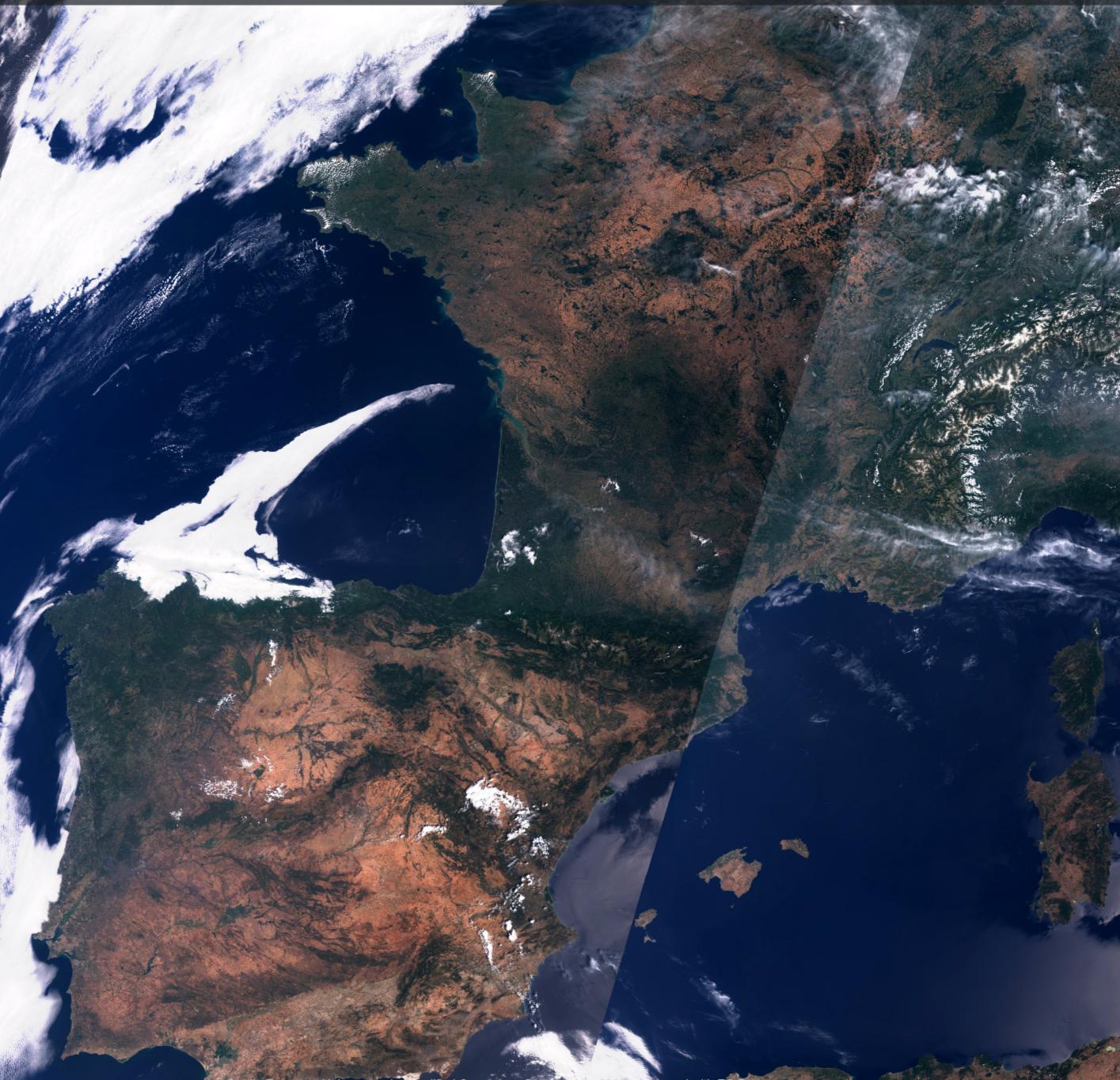
Next we’ve got France at the end of July 2019
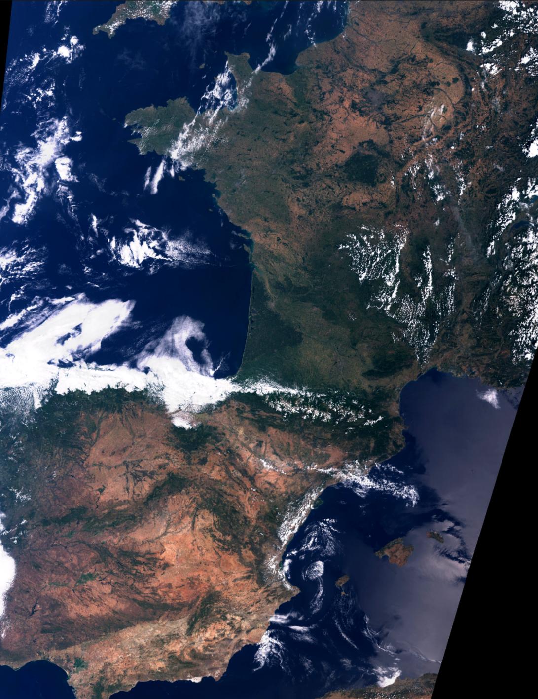
For comparison we’ve also got France end of July 2018 … but it’s pretty clear that July 2019 was HOT
You can find the original tweet fr omCopernicusEU at https://twitter.com/CopernicusEU/status/1158688468693856259
Images via the Copernicus tweet shown full size for comparison